Turning a phone number into a profile.
Himalaya’s loyalty site had 35 lakh members and almost nothing about them. It asked for everything and showed them nothing back. I made the exchange visible.
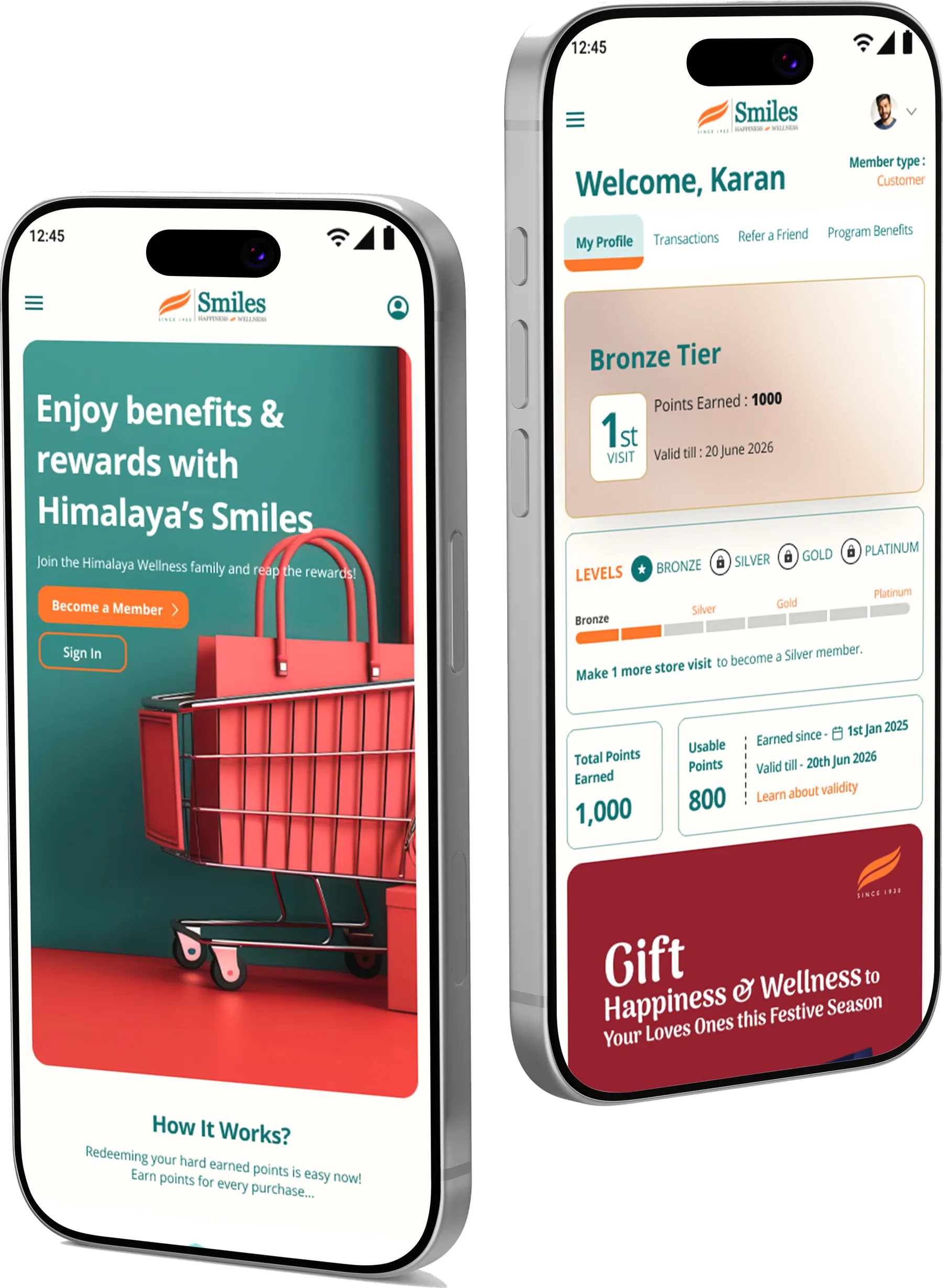
“Make 1 more store visit to become a Silver member.”
Product / UX Designer: research, problem framing, IA, interaction, UI
Solo designer with client marketing & CRM stakeholders
Audit · heuristic evaluation · competitive · UX strategy · redesign
Live in market
- Name
- On file
- Phone
- On file
- Gender
- Unknown
- Birthday
- Unknown
- Tier
- Unknown
- Last visit
- Unknown
What 35 lakh enrolments at the till actually captured: a name and a number. Everything else, blank.
35 lakh members. Almost nobody home.
Smiles looks like a loyalty programme. It’s really a first-party data engine: the only thing linking a real, identified shopper to what they buy, where and how often. Enrolment was already solved at the till: 35 lakh sign-ups, a name and a number. Everything after that stalled. The company could reach millions of people, but only as a mass.
The leak, in three numbers.
Gender coverage and active use weren’t two problems. They were one problem measured twice: a privacy-cautious shopper logs in, sees a screen that tells them nothing, is asked for their spouse’s name and their pet’s age, and leaves.
People don’t quit loyalty programmes because the rewards are bad. They quit because the value is invisible.
The reframe · a broken value exchange
A competitive teardown of five Indian programmes and secondary research into what members say were run separately, and landed on the same sentence. That changed the brief from redesign the screens to flip the exchange.
Four lenses. One verdict.
I wanted agreement between methods to carry the argument, not my opinion. Each ran without reference to the others.
Current-state audit
Screen-by-screen teardown of the old mobile flow, login through terms.
Heuristic evaluation
Nielsen's ten heuristics, severity-rated critical / major / minor, ranked Now / Next / Later.
Competitive benchmark
Five programmes across retail and category: Tata Neu, Nykaa Prive, 1mg, Apollo and more.
Voice of customer
Twenty member interviews, ten existing and ten new, plus the category's public app reviews.
usability issues across screens.
issues were critical. In all three, members could not see their own points, tier or progress.
screens after login were all titled “Dashboard”. Even the Profile page.
Every competitor states what a point is worth in rupees. Nykaa Prive gives 1,000 points for signing up and 100 per review, so members earn before they spend. Smiles did the opposite: signup demanded personal details and gave nothing back, then left members at zero points. The fix: show the value upfront and reward small actions, not just purchases.
first-time signups learned nothing about points, tiers or rewards on the landing page.
joined mainly for the first-purchase reward or a special-occasion offer.
were never told when their tier dropped.
could not say what a Smiles point is worth or how to redeem it.
Existing members knew their tier. New members knew nothing. These four numbers became the design brief: show the value on first contact, make a point's worth obvious, and never let a tier drop in silence.
“Just the points are showing as 7011 overnight from 9982 the previous evening... It is as if those 3k points never existed, no trace of it in the app or statements.”
“Apparently, being a 'valued customer' on Nykaa just means they know you're willing to pay more. And they use that data against you.”
“Few months back I lost around 350 supercoins because of expiry and not able to redeem it. Flopkart should change their shitty policies.”
“ICICI said its payback who charged and Payback said its ICICI Bank. Big bank, clueless processes...”
“Each time I have shopped... they had technical issues and they were not able use the amount from wallet... It is unfair to fight for my own money.”
“After buying Swiggy One, all coupons disappear and my expenses increased. What a waste.”
Smiles has no public reviews of its own, so I listened to the category instead. The anger is never about reward size. It is about invisible balances, silent expiry and data used against the member. That is the feeling the redesign had to reverse.
What I traded, and what it bought.
Demote the promo banner below the member's own data
The old dashboard led with a campaign banner, above the balance. Marketing lost the most valuable pixels on the page: the whole thesis in one layout rule.
Trade-off: campaign visibility ↓ · comprehension ↑
Make gender and date of birth mandatory at sign-up
The two fields whose absence defined the brief. More required fields means more friction, but voluntary completion later was already proven not to happen.
Trade-off: form length ↑ · every new member fully profiled
Lead the tier ladder with visits, not spend
Tiers were already earned by visit count in a rolling 12 months, unusual in Indian retail, and buried in FAQ question nine. Surfacing it turns an abstract system into one achievable instruction.
Trade-off: less premium-feeling than spend tiers · far more actionable
Ask for data as a game, not a form
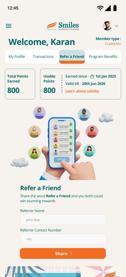
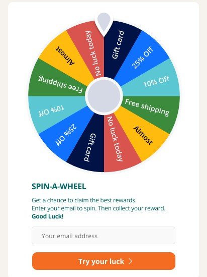
Every data request had to carry a visible reward. Profile, birthday, referral and spin-to-win each trade a field for something the member can name.
Trade-off: more mechanics to maintain · a fair exchange
Same screen. Now it talks back.
Same screen, same crop. The old “Dashboard” was a banner, a title, an illustration and three buttons.
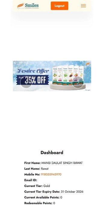
- Promotional banner above the balance
- Decorative illustration, repeated on every screen
- Three identical orange buttons
- No points · no tier · no name
Points and tier existed one level deeper, on a screen also titled “Dashboard”. Reconstructed from the audit.
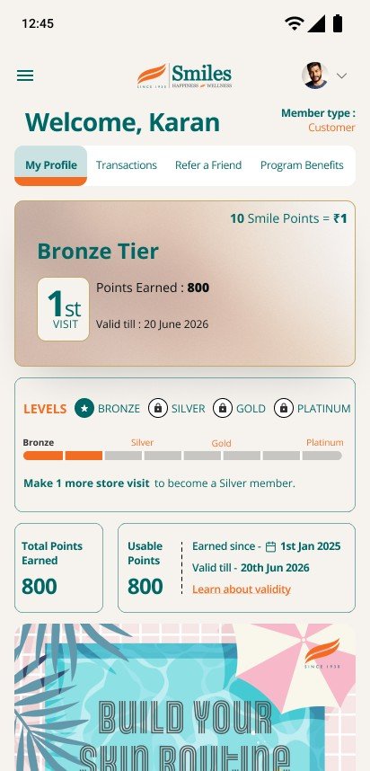
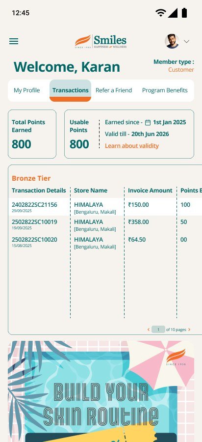
- Tier, balance and validity in the first screenful
- Progress named in visits, not spend
- “Make 1 more store visit to become a Silver member.”
Nothing asked for free.
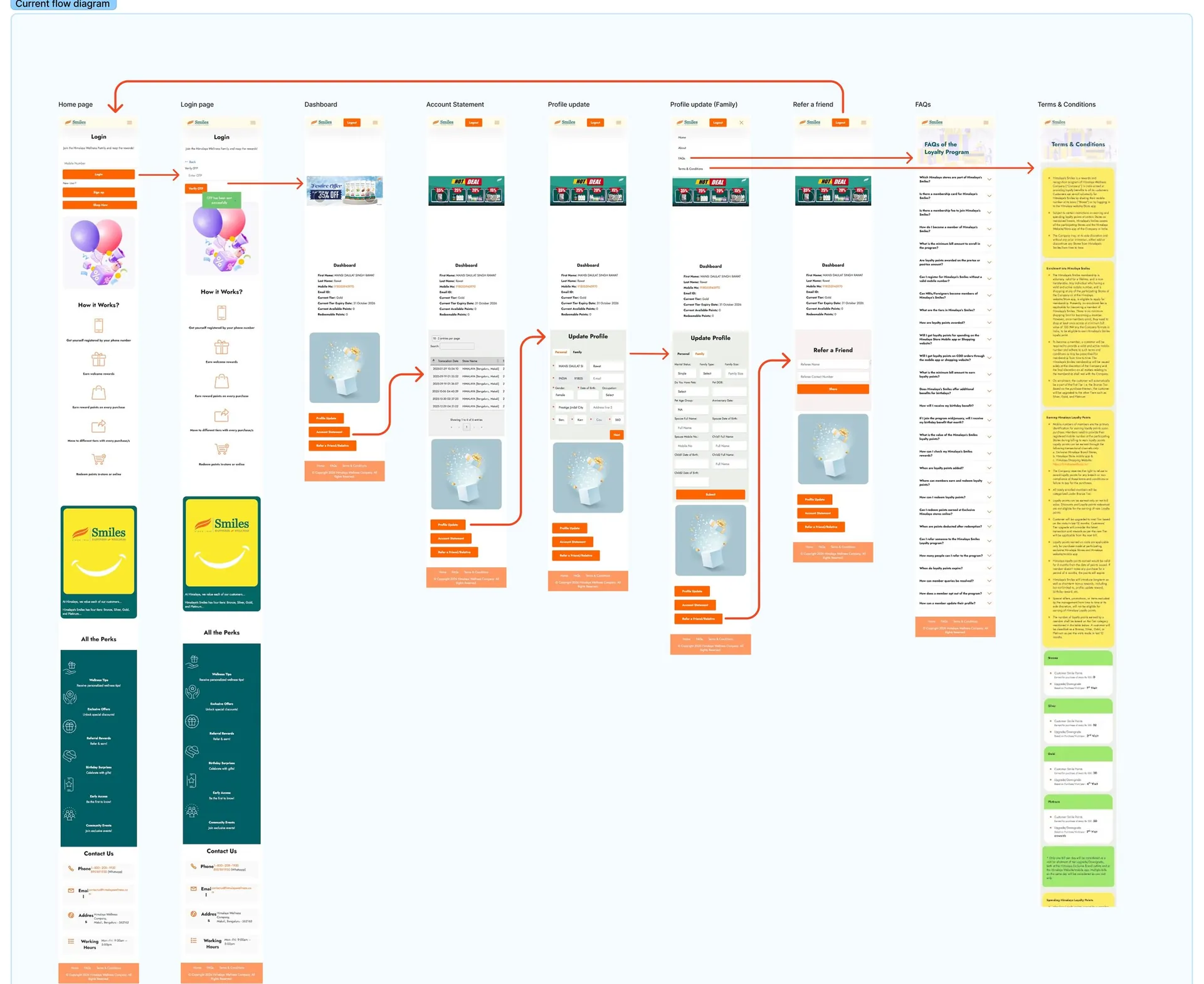
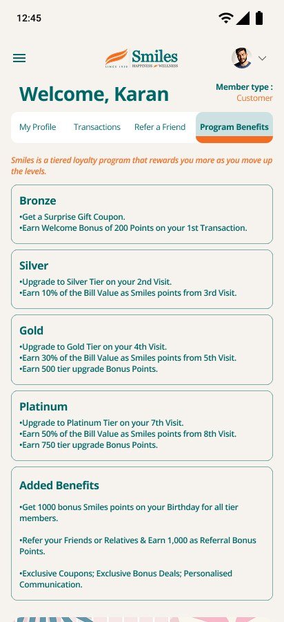
Shipped. The scoreboard is set.
The redesign shipped; outcome data hasn’t landed. Rather than borrow numbers I can’t stand behind, here are the baselines it will be judged against.
gender on file at baseline: the decisive metric, tracked monthly against the active base
of members active on the website (35,000 of 35,00,000)
to see points & tier, previously a trip into Account Statement
screens named “Dashboard”, down from nine
Honest framing. No post-launch metrics are claimed. Registration completion, OTP drop-off and spin participation are instrumented against baseline, but the gender and DOB curve is the one that proves or disproves the thesis. People only hand over a birthday when they can see what it buys.
What I’d fix next, from my own review of the live build
- 01Publish the rupee value of a point. Every competitor does; Smiles still doesn't.
- 02Price the profile. Step two asks twelve household questions with no reward attached.
- 03Rebuild the spin: spin first, every segment pays, and ask for a field the profile is missing.
- 04Put the referral number on the referral screen. “Stunning rewards” is vague; “1,000 points” isn't.
- 05Surface downgrade and expiry as nudges, not rules discovered after the fact.
- 06Deliver “Wellness Tips”: listed as a benefit, not yet built, and the brand's most defensible differentiator.
The promise was always there. It just needed to be seen.
Nothing about the programme changed to make “Make 1 more store visit to become a Silver member” possible. The tiers, the visit rule, the birthday bonus, the referral reward: all of it already existed, and all of it was invisible. The work was making an existing promise legible.